Design Principles
The Tizen 4.0 TV design principles provide a clear and comfortable visual identity for your application. The harmonious and delightful elements help the user get information easily and enjoy content fully.
There are 3 design principles used in Tizen 4.0 TVs:
Simplicity
Using many decorative elements on the screen at the same time can confuse and distract the user.
Simplify your application design to allow the user to clearly identify the content.
Circular Icons
Tizen 4.0 TV icons are circular, covering a smaller area than rectangular icons. Consequently, the user can see more of the screen background.
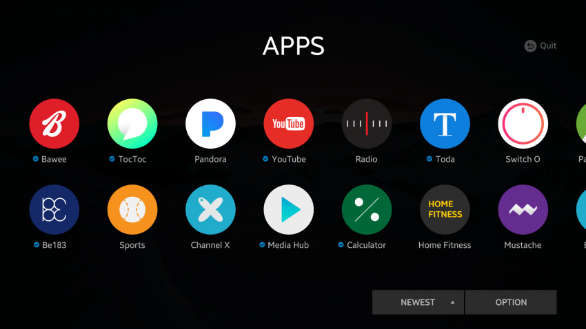
Circular icons taking less space on the screen.
Hidden Inactive Icons
An inactive icon partly hides itself to take up even less space on the screen. This approach also allows the user to recognize active icons without visual interruption from inactive icons.
Inactive icons are hidden.
No Unnecessary Decorations
Within functional design elements, clean up unnecessary decorations, such as a divider bar. Instead, use more functionally-effective visual expressions or separate information. It makes the UI look cleaner and more organized.
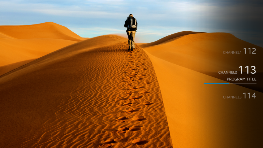
No divider bar between different pieces of information.
Natural Intuitiveness
Enhance the usability and make the interface naturally familiar to the user by, for example, using shadow effects. This allows the user to access content and information easily with a pleasing natural visual balance.
Shadow Effect
Shadow effects can add subtle but clear emphasis to generated items. The effect is natural and consequently also harmonizes with the content. The user can focus better without any visual strain.
Shadow effect emphasizes the element.
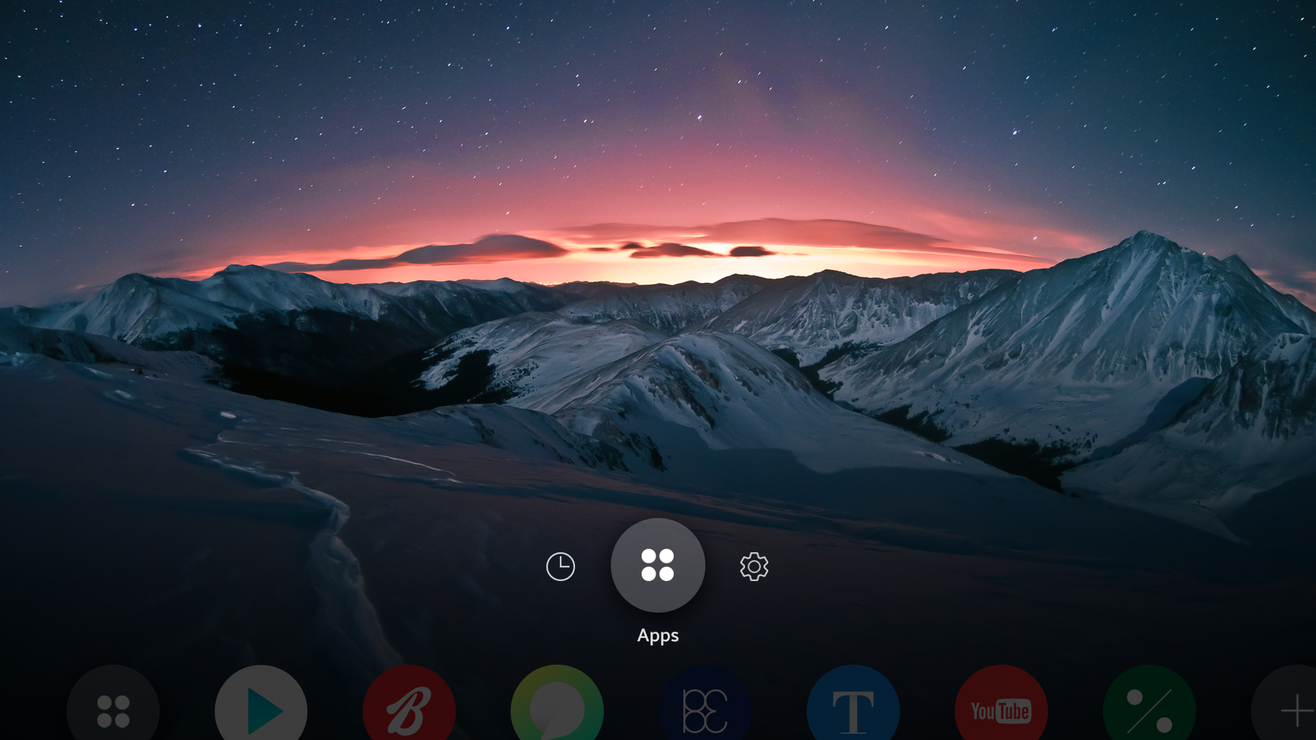
Breathing Space
A screen that is full of design elements can be eye-catching, but it makes the user unable to focus on any specific item. Use screen space properly to guide the user’s attention.
Allow Empty Space
A right amount of empty space between different pieces of information makes the UI both easier to understand and more pleasing to look at. Do not think that precious screen space is wasted. Properly used empty space is a proven technique for better screen design.
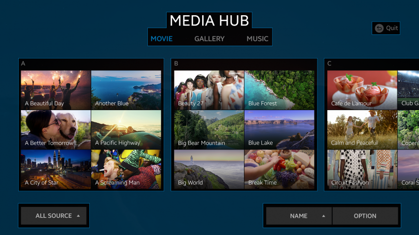
Leave breathing room between the elements.
Prioritize and Balance
Prioritize elements on the screen based on their importance, and balance the primary and secondary elements accordingly. When the information is correctly balanced, the most important content elements are displayed in the most visible manner.

Less important back key information is dimmed.